 Barnorama All Fun In The Barn
How to Create a Logo for Your Target Audience
What makes businesses like McDonald’s Coca-Cola, Pepsi, and Nike so successful and long-standing? Sure, they all have a great product to offer that many people can’t seem to get enough of, but what has made them rise above the rest? Think about it, what comes to mind when you hear the name of one of these iconic brands? The logo.
These symbols have been ingrained into our minds. It’s easy to spot a McDonald’s from a mile or two away, and once your eyes catch that glimpse of yellow, you instantly get a hankering for a Big Mac. Having a memorable and easily identifiable emblem for your brand can increase its popularity and success.
What Makes an Effective Logo?
There are five traits for an effective design. The five traits are:
- simple
- memorable
- timeless
- versatile
- appropriate
Simplicity
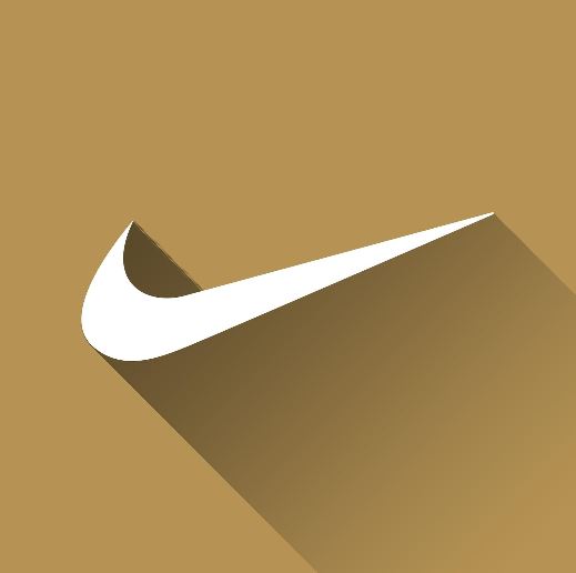
When it comes to designing a logo, remember the K.I.S.S. principle. Keep it short and simple! A good design is unexpected and doesn’t have many small details. The obvious example here is the iconic Nike “swoosh” symbol. It is no doubt the first thing that comes to mind when someone hears the word “Nike” before they ever imagine a pair of shoes. Simple means memorable. Attention spans are short, and simple logos will stay in someone’s mind a lot longer.
In order to understand that better and also see different logos evolutions, you can check specialized website LogoRealm, which is all about logos history and changes.

Make it Memorable
McDonald’s golden arches are possibly the most memorable symbol in the world. The bright yellow color catches your eye when you are speeding down the freeway, and the “m” shape reminds you of the “McDonald’s” name. It is memorable because it does’t involve too many different fonts or colors. The eye is naturally drawn to it.
Timelessness
You don’t want to follow the latest design trends only to end up with something outdated and out of style six months later. Timeless designs stick in people’s minds. Stand out from the pack and you are sure to create a design that will stand the test of time.
Versatility
Your design should be adaptable to any media and any scale or size. Be sure to design them in vector format. How will the design look in black and white? In a single color? Will it be readable when it is very small? Will it look distorted when it is on a billboard? All of these things should be considered in the design process.

Appropriateness
Logos get their meaning from the company they are associated with. The Nike emblem certainly doesn’t show sneakers, and the Mercedes emblem doesn’t have a car in it. The fonts and colors you use in the design should match the company, brand, or service. You wouldn’t use rainbow colors to advertise a law firm. Logos need to draw in your target audience.
Appealing to Your Target Audience
Before the design process begins, you need to determine what logos your target audience is already familiar with. For example, if you are a fast-food company, your target audience is already conditioned to be drawn to logos associated with fast food. What colors and fonts are these successful companies using? Be original in your design but be appropriate too.
You may want to create a customer avatar before beginning your design. What are your customers’ interests? What problems do they have? What are their dreams and aspirations? Getting inside the mind of your target audience can help you figure out what type of designs would turn them on or turn them off.
Consider the emotion you need your target audience to feel in order to buy your product. If you are a law firm, your design should invoke seriousness in your target audience. You want them to take you and their issues at hand seriously. If you are a daycare, you want to invoke feelings of happiness and security, so you may use pastels as opposed to darker colors.
Uniqueness and Wearability
Anything you design should be specific and unique to you and your brand. While you may use similar concepts to other companies, you should ultimately end up with a design that turns heads and gets your audience interested, without confusing you with another brand.
Consider how your design would look on a shirt, jacket, or hat, even if you don’t sell clothing. Many successful brands, such as Coca-Cola, eventually make it onto clothing. If people don’t like your symbol, they might be less inclined to wear something with your design on it. When your audience wears your design, it gives your brand social proof and helps spread the word.
Consider your target audience in every aspect of your design. What do they want to see, feel, and potentially wear? Keeping your audience in mind, along with basic design principles, will lead to a great design every time.