 Barnorama All Fun In The Barn
Dive into a world of fascinating data and mesmerizing graphics that will ignite your curiosity and expand your understanding.
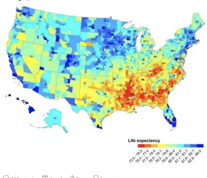
This map shows life expectancy in the different counties throughout the USA — looks like the Upper Midwest is a good place to go if you want to live a while!
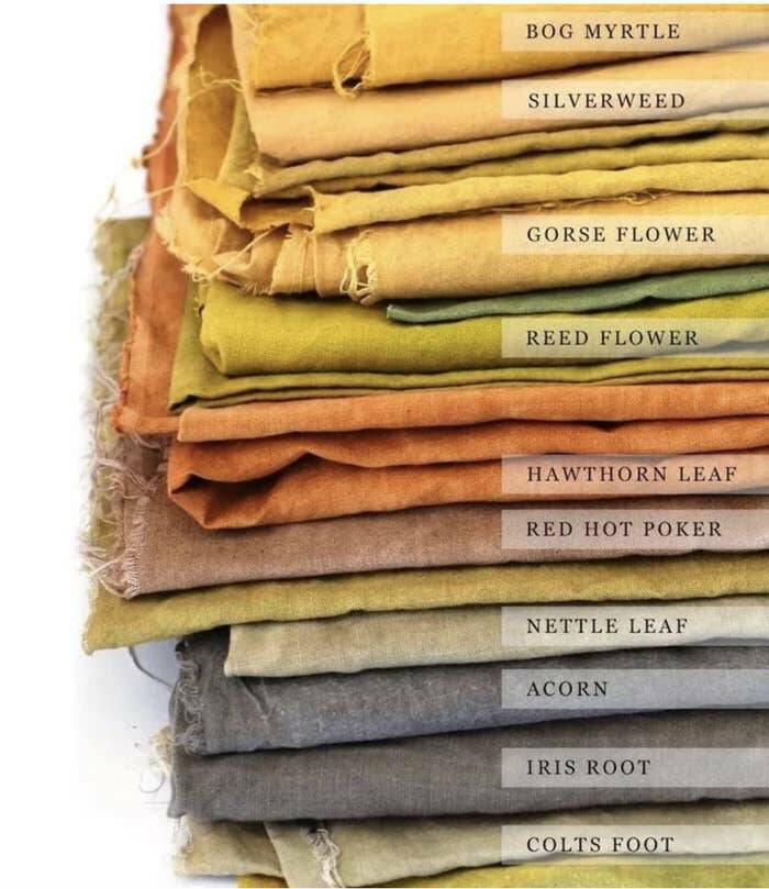
And this fascinating chart shows you the typical colors of clothes during the Middle Ages…and the natural dyes people used to create them!
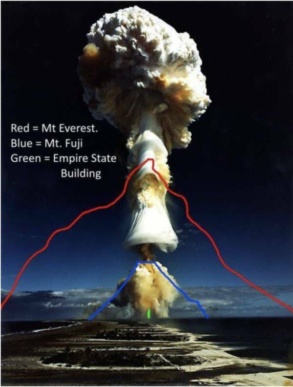
Nuclear mushroom clouds can be so much more staggeringly large than you likely realized.
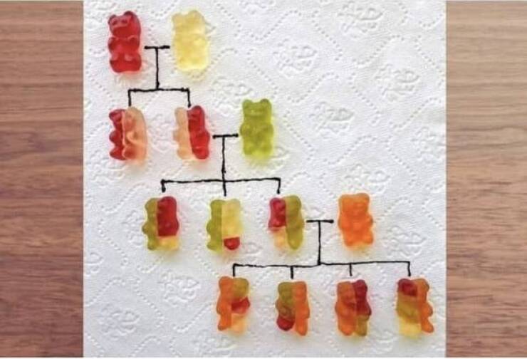
This ingenious image does a great job of explaining how genetics work…and making you crave gummy bears.

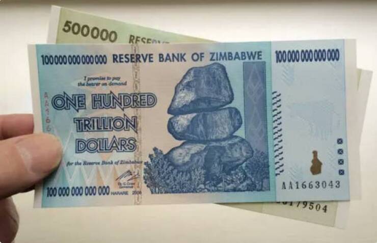
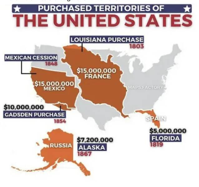
Speaking of a trillion…this fact is wild. Hyperinflation hit Zimbabwe so heavily in 2009 (inflation literally reached 230,000,000% that year!!!) that the country introduced a 100 TRILLION dollar bill…which was worth about 40 US cents.
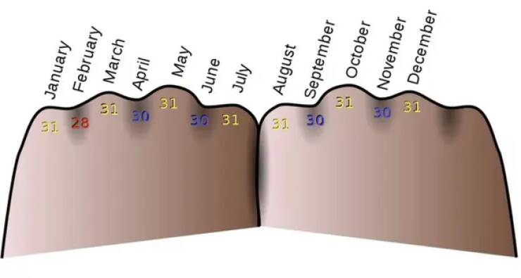
This chart shows a trick for remembering how many days are in each month (the “knuckles” months are the ones with 31 days).
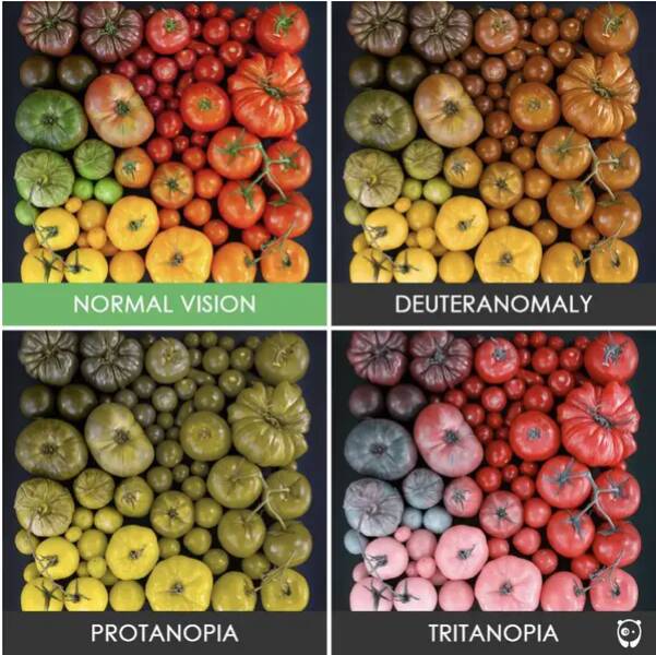
And being colorblind doesn’t mean you see the world in black and white — it’s that you have a narrower perception of color.
This incredible image shows just how much a cervix can dilate during childbirth.

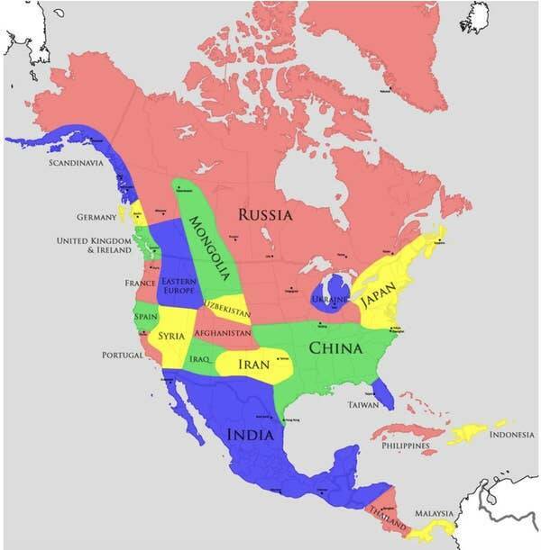
This US map chart explains that the American Southwest’s climate is like the Middle East’s, and Washington’s is like England’s!

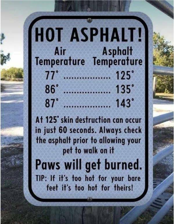
And, speaking of dogs, the asphalt your pup walks on is probably way hotter than you realized.
And, while things are pretty secretive in North Korea, it appears this wild fact is (or at least was) true — their professional basketball league has their own rules, including dunks being worth three points!

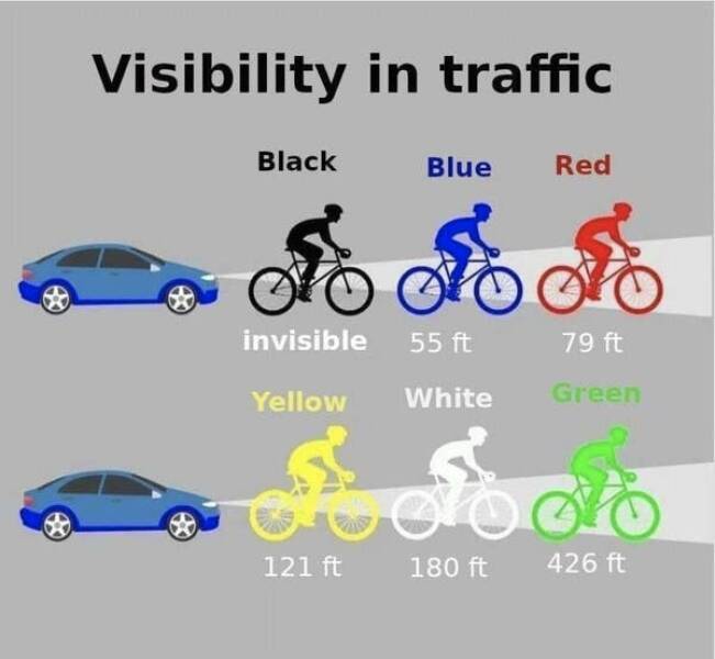
What you wear running or riding a bike at night makes a shockingly HUGE difference in how visible you are.
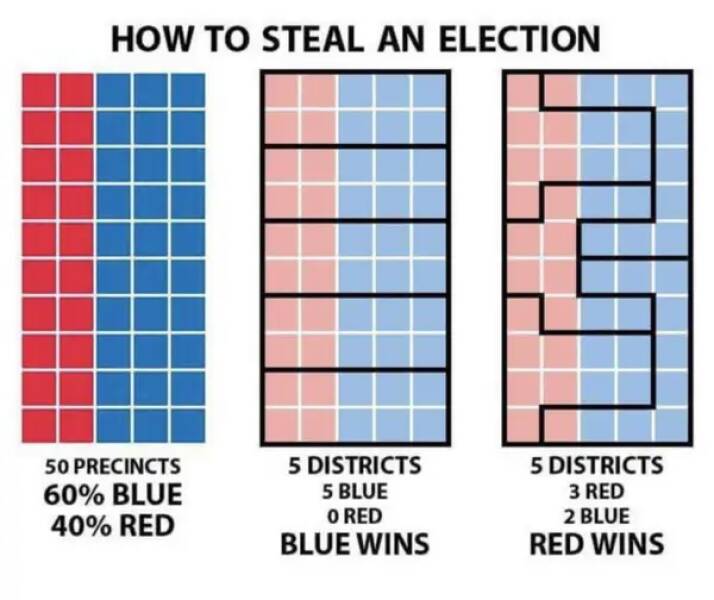
And this graphic explains how gerrymandering works in simple terms…so we can all understand how infuriating it is!
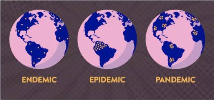
This is the differences between endemic, epidemic, and pandemic…explained in the simplest way possible.
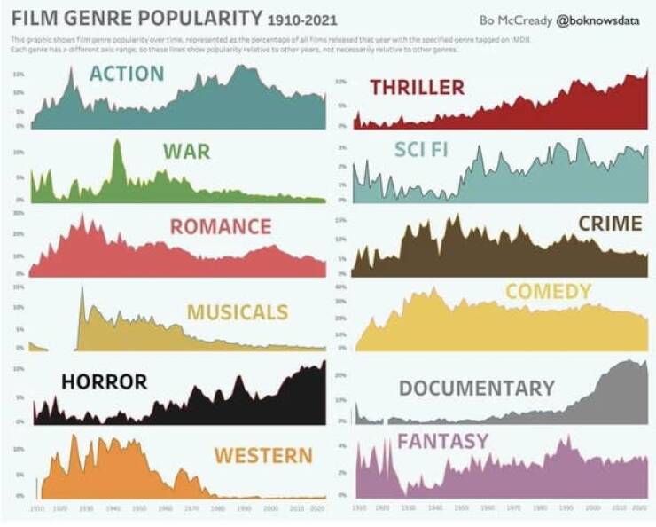
If you love movies, this chart is FASCINATING.
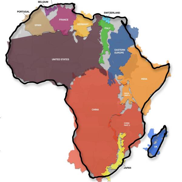
And I knew Africa was big but not THIS BIG!
This cool chart shows you 16 — yes, 16! — different sizes of mattresses.
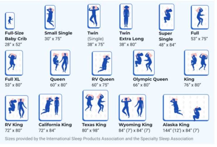
And if you’re wondering what the heck an Alaskan King looks like in person…well, here’s one.

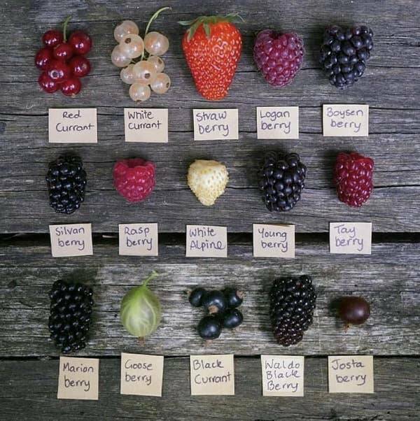
And this chart will teach you how to recognize on sight a bunch of different berries.
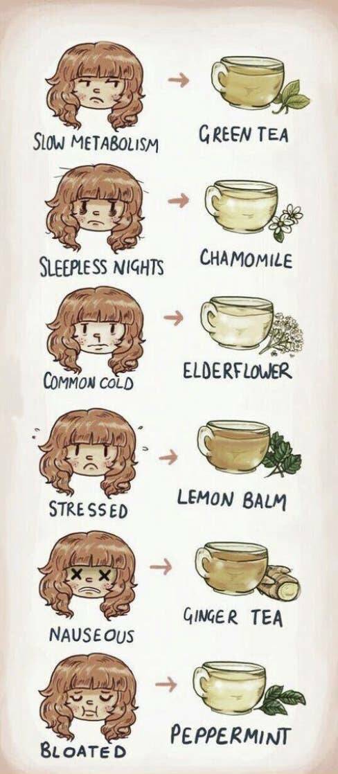
This chart tells you which tea to drink in every situation.
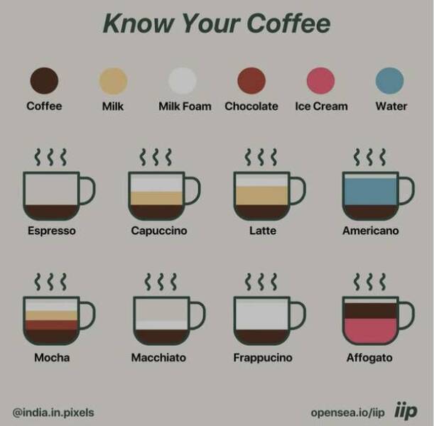
This chart takes the mystery out of coffee.
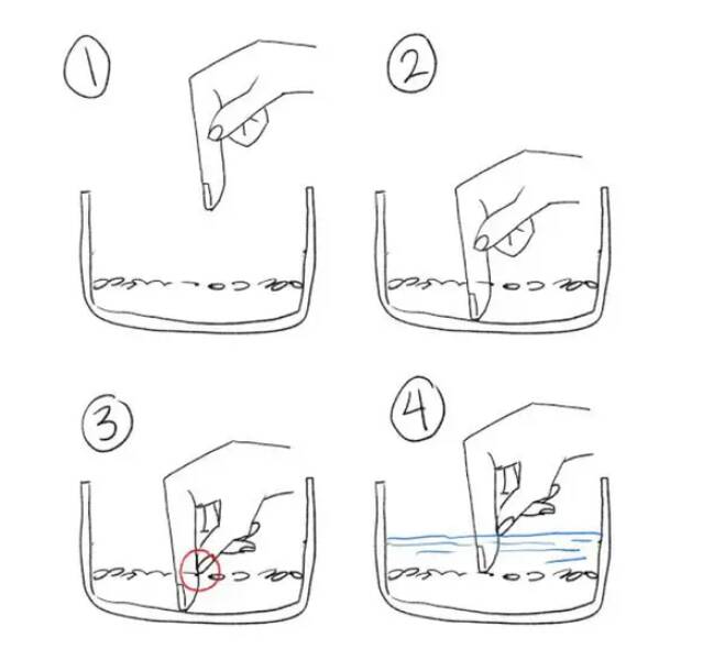
And this trick for measuring out rice and water is a game-changer.
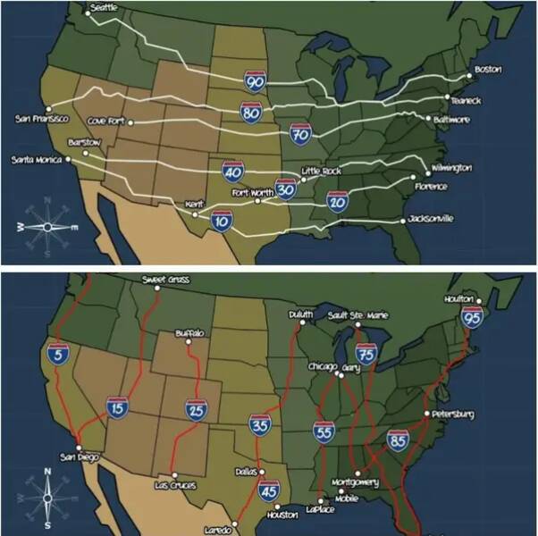
Get this — the numbers used for our Interstate Highway System aren’t random…they all mean something specific.
Source: www.buzzfeed.com