 Barnorama All Fun In The Barn
Pepsi
According to Davis Bradham, the creator of Pepsi, his drink made of sugar, water, caramel, lemon oil, and nutmeg stimulated the digestion process. This is why he came up with the name Pepsi based on the world dyspepsia which is a catch-all term for all digestive disorders.
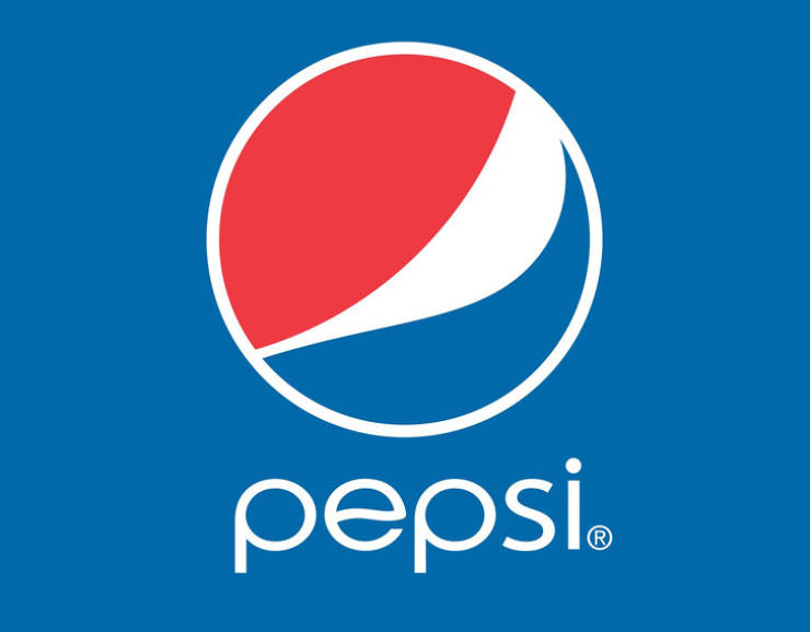
In more than 100 years of its existence, the logo has changed numerous times. Today, it’s a circle made of blue and red halves separated with a white wave. Interestingly, the company had to pay more than $1 million for this logo. According to its creators, it references the earth’s magnetic field, Pythagoras’ theorem, and the theory of the golden ratio. But the reference to the US national flag is far more obvious.
Chupa Chups
Enric Bernat once noticed that parents often told their children off when their hands were covered in sweets. This was when he came up with the idea to sell candy on sticks and this simple but genius idea made him rich.
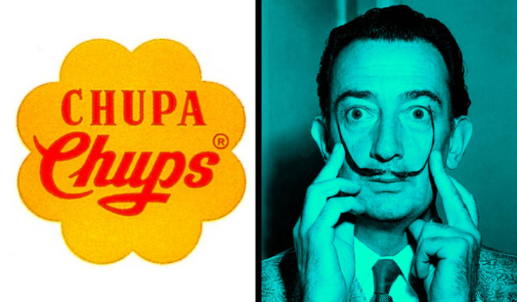
The name of the candy comes from the Spanish verb, chupar, or suck. But the logo is far more interesting: Salvador Dali drew it himself because Bernat asked him to. The artist suggested drawing chamomile and the colors were inspired by the Spanish flag. The shape of the logo is what it is for a reason: the picture is not on the side but on the top of the candy and the chamomile shape is the best part. Later, the logo was tweaked a little but the general look remained the same.
Asus

Few people know this but the name of this Taiwanese company has a very interesting history. As it turns out, the founders wanted to name it after the horse with wings known as the Pegasus. But later, they decided to get rid of the first 3 letters to make their company first in the telephone book.
IKEA
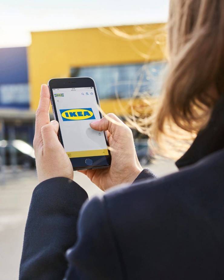
Most of the products in this store are named with hard-to-pronounce Swedish words but the name of the company is very different. The creator of the company, Ingvar Kamprad, came up with an acronym using the first letters of his name and the name of the farm Elmtaryd in Agunnaryd where he was born.
The logo is pretty simple and references the Swedish flag’s colors.
Android

According to a legend, the founder of the company, Andy Rubin, was called android because of how much he loved robots. So when he started working on his own operational system, he chose this name for it.
The Android logo was designed by Irina Blok. She said that she pictured a robot but just couldn’t come up with the right image. It’s funny that the pictures drawn on restroom doors helped her come up with an idea for what she wanted. This is the origin of the green person with antennas on its head.
Starbucks
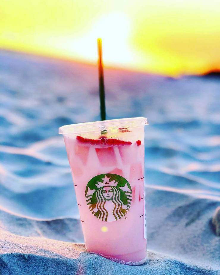
The name for the famous coffee chain was made up by the owners almost by accident. They gathered one evening and started making up words that started with “st”— they thought that these 2 letters would be a great match and they sounded cool. Then, someone found an old mining map and found the town of Starbo. The friends then remembered one of the Moby Dick characters, Starbuck. This was how the name of the iconic coffee company came to be.
But why is there a siren of the sea on the logo? This is a reference to the book. Starbuck from the novel was an assistant on the ship. The creators decided to go along with the sea theme, choosing the 2-tailed mermaid from Ancient Greek mythology as their logo.
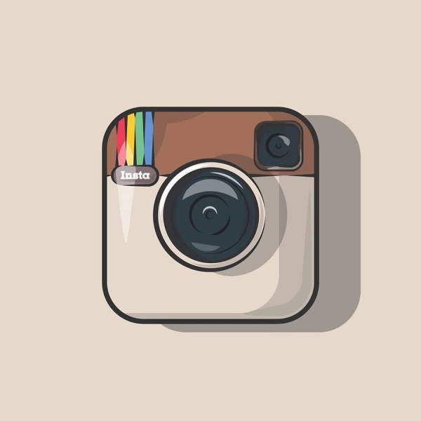
The founder of the app, Kevin Systrom, was interested in photography before he created Instagram. He really loved the instant photos made by Polaroid, for example. This is where the word “instant” came from. Photos can also be sent as messages or telegrams, hence the combination of instant and telegram to make Instagram.
The logo of the company, in turn, was inspired by the name: a slightly altered picture of the retro camera Polaroid OneStep. Later, it was changed to be more minimalistic but you can still see the camera in the logo.
Virgin

Today, Richard Branson is one of the most successful businessmen in the world and the owner of a huge conglomerate of companies from recording companies to airlines. The unusual name for this future brand was made up by accident. During one of the parties he went to, some girl suggested that Richard name his company Virgin (he wasn’t sure if she was serious or joking). But he went for it and gave his company the extravagant name. It’s believed that decisiveness and courage helped Branson build his true empire.
Amazon
Jeff Bezos launched his online bookstore in 1994 and came up with a name for it right away — Amazon after the river, Amazon. Only later did his store explode in popularity, just like the river, and become one of the biggest online retailers in the world.
The company changed the logo several times and the one that is used today has its own meaning. Firstly, Bezos dreamed for his store to sell every product from A to Z. This is why the arrow goes from A to Z in the logo.
Secondly, the arrow is shaped like a smile, symbolizing Amazon’s desire to fully satisfy the needs of its customers and greet them with a nice smile.
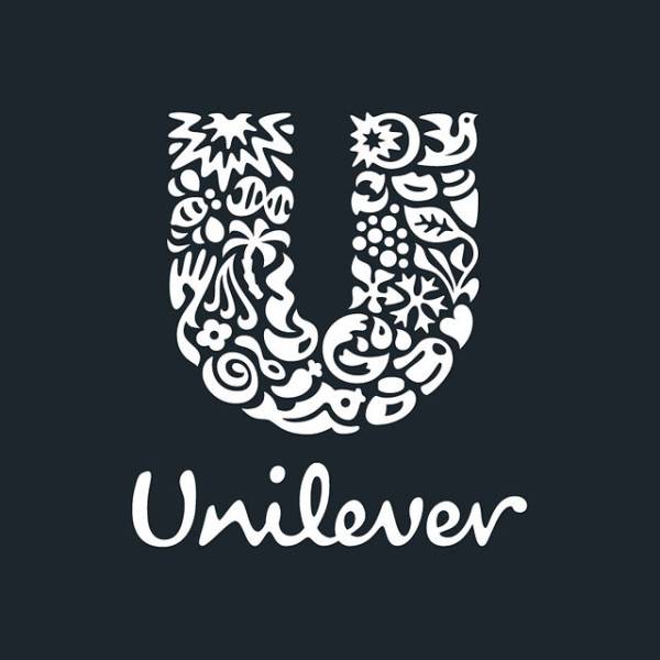
This world-famous organization combines the products of more than 400 brands. The logo for such a huge company is supposed to be universal, easy to understand, and recognizable. As it turned out, every U has its own meaning. For example, the plant symbolizes the fact that the company tries to save the environment and the waves stand for pureness and freshness.