 Barnorama All Fun In The Barn
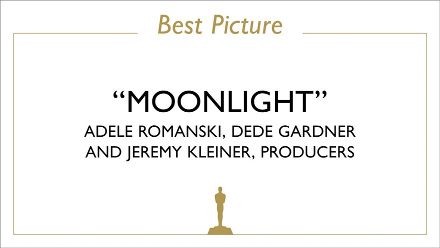
The Oscars of 2017 went down in history not only because of a single movie (‘La La Land’) receiving the record amount of nominations but also because the same movie was falsely awarded the Best Movie award when the actual winner was ‘Moonlight’.
There was a lot of speculation about what went wrong during the announcement but now it’s clear that there was a mix-up of envelopes. And instead of the best picture, the presenters Warren Beatty and Faye Dunaway received an envelope with the best actress category winner Emma Stone from ‘La La Land.’
Now to make things even worse, the announcers had little-to-no indication that they received the wrong envelope because of the lousy typography used on the card. Even though it said Emma Stone on top, it clearly said ‘La La Land’ below, with only the small indication at the very bottom that it’s the best actress award.
Original shot of ‘La La Land’ director Kenneth Lonergan holding the Best Picture card
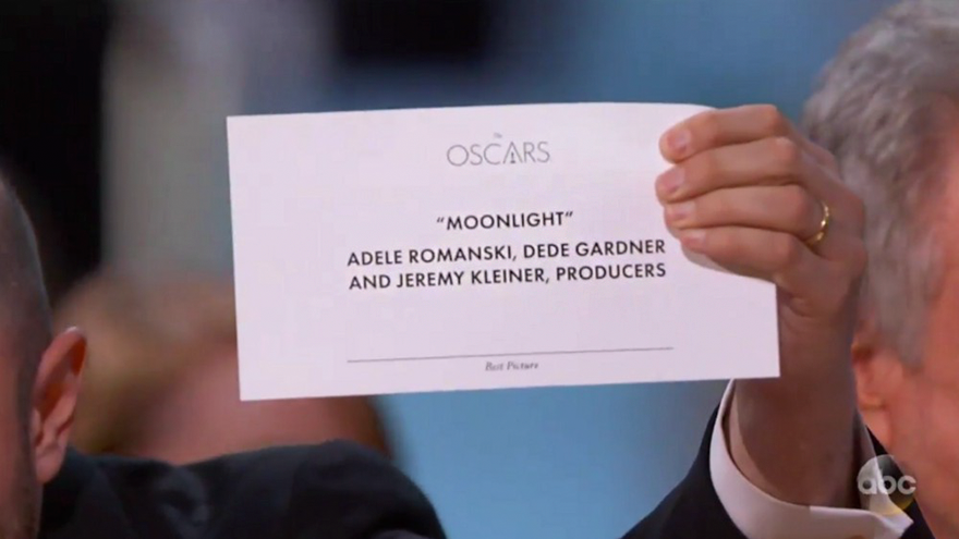
‘Based on that card design, I’ve reconstructed the card Warren and Faye would’ve seen, the one they received’

‘That’s horrible typography. I will emphasize horrible again. Horrible. Or to be nicer, not good. Look at it again. Of course, anyone could’ve made the same honest error.’
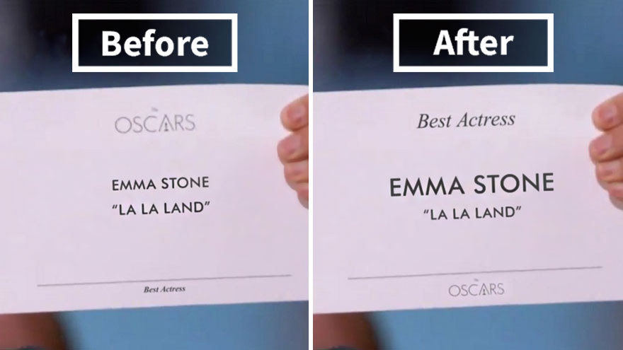
‘Now, let’s imagine an alternate timeline where the presenters were given this modified version of the wrong card, using the same elements of the original card’

‘It may not seem like much to a regular person, but changing the sizing, positioning, and weight of the text makes a big difference. A big enough difference that this embarrassing mistake could’ve been prevented.’
Now compare these two side-by-side to see what difference a good typography can make
So here’s a suggestion for the next year: